Creative Technology
Pop Stars Energy
Clarapetra's Pop Stars world translated into four rocket-bottle editions, AI-assisted campaign advertising, and an interactive brand experience.
- Ownership
- Creative direction / Brand and packaging design / AI art direction / Interactive design & engineering
- Current status
- Working interactive portfolio design concept; not manufactured or for sale.
- Designed for
- Creative directors, brand teams, music collaborators, and audiences exploring Clarapetra's visual world.
- Case study
- 2 min read
Executive summary
The decision brief
Ownership, the central tradeoff, collaboration boundaries, and what the current record supports.
-
01 Role
Creative direction / Brand and packaging design / AI art direction / Interactive design & engineering
-
02 Key decision / tradeoff
Translate the music's visual identity into an own-brand rocket bottle and make each edition visibly distinct through its actual bottle design, prominent name, color and matched campaign photograph.
-
03 Collaboration boundary
John N. Farmer directs the concept, identity, packaging, image generation, copy and interactive implementation. Specialist agents support marketing, visual design, audience interpretation, UX and engineering review; John retains creative direction and final review.
-
04 Current evidence
Four reviewed rocket-bottle images, five coordinated campaign visuals, canonical source references and an interactive edition selector. Images and publishing copies are archived with checksums; each selector pairs the actual bottle and campaign image.
Documented period · 2026-10-13
Scope & evidence
Outputs, evidence, and limits
Outputs describe what was made or delivered. The evidence boundary below states what has—and has not—been validated.
Responsibilities
- Creative direction and brand translation
- Rocket-bottle silhouette and label hierarchy
- Four-edition packaging system
- Clarapetra identity and wardrobe continuity
- Campaign image art direction
- Accessible edition selector and gallery design
- Web implementation and responsive layout
- Canonical asset provenance and human review
Documented outputs & delivery record
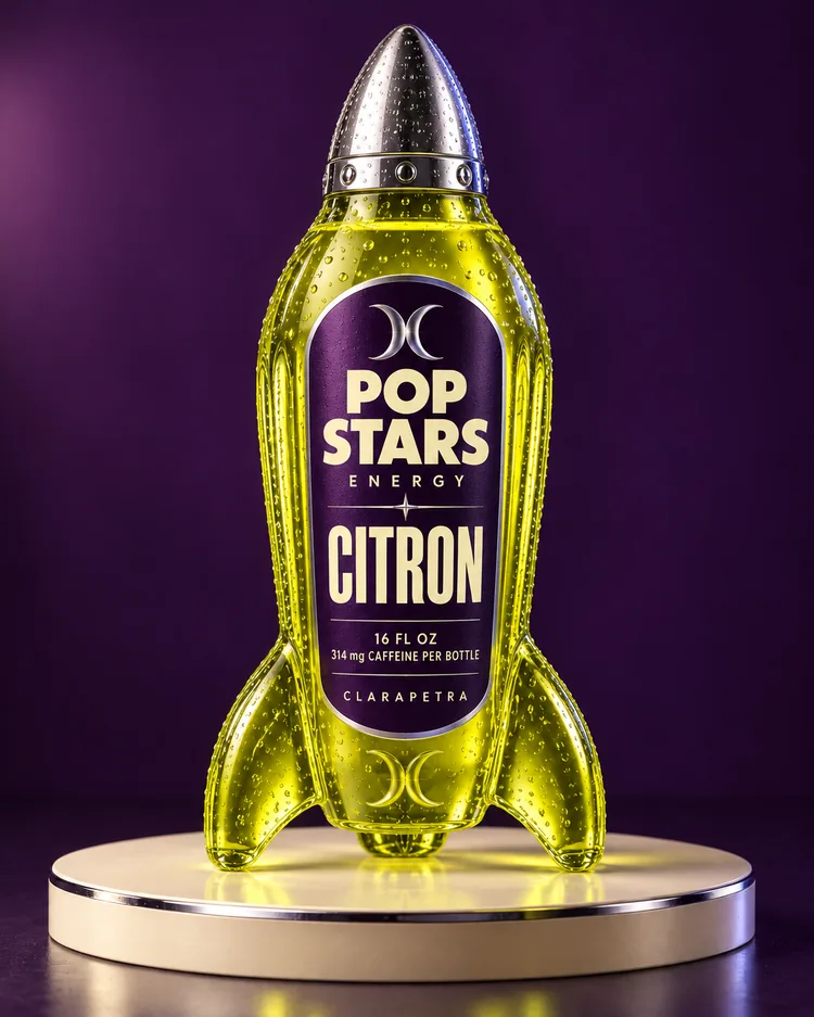
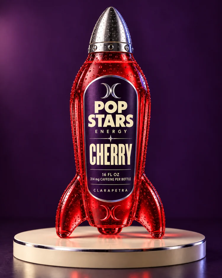
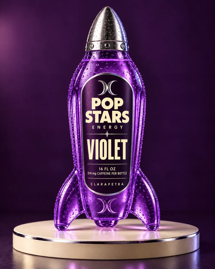
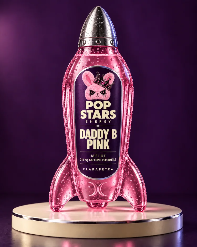
- Designed a family of four distinct editions: Citron, Cherry, Violet and Daddy B Pink.
- Connected bottle designs, five AI-assisted campaign visuals and the existing Pop Stars album artwork in one campaign experience.
- Specified an edition selector that changes the actual bottle, photograph, name and palette together, with full-image links and keyboard gallery controls.
Visual archive
Selected visuals
4 selected images from the project archive.
Full story
How the work took shape
The music, translated into a brand
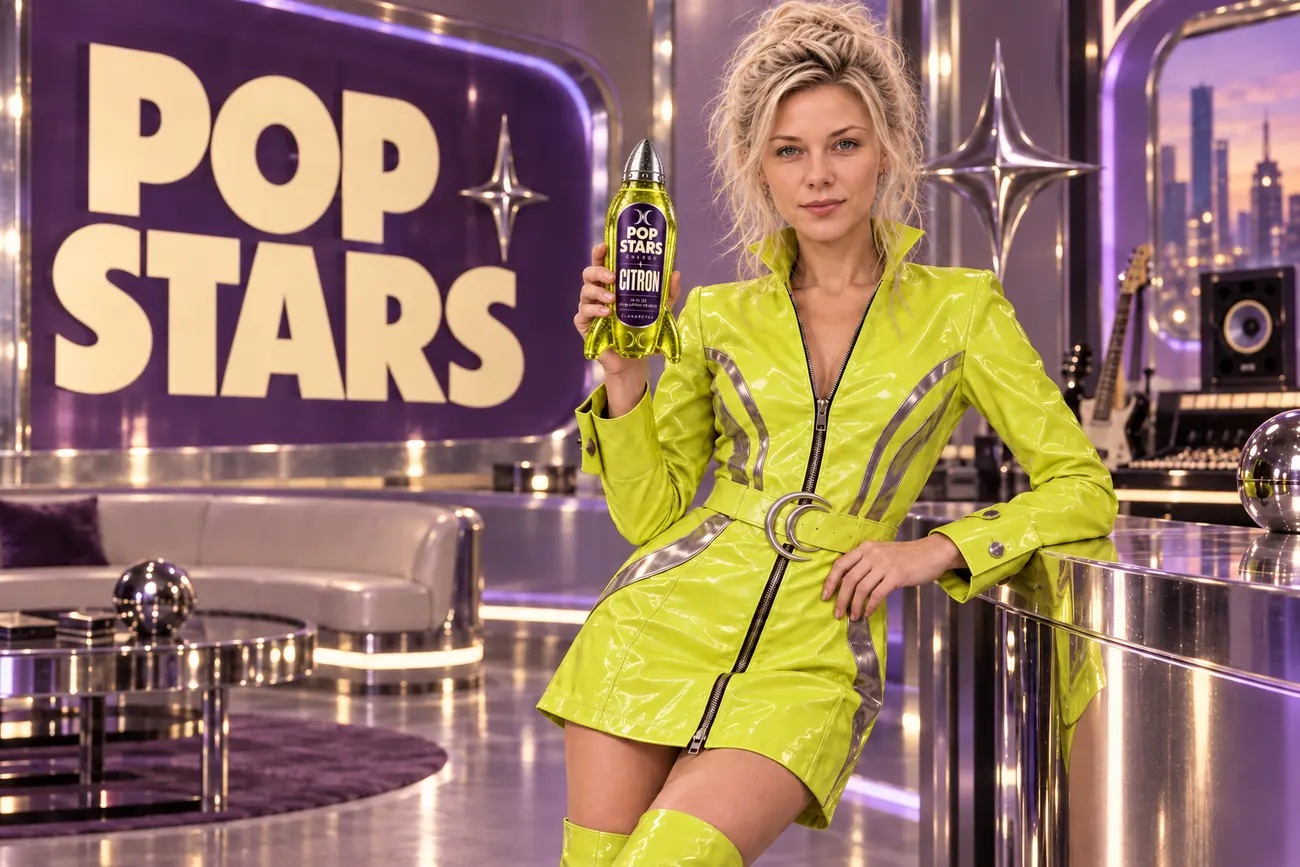
Pop Stars Energy extends Clarapetra’s existing visual world into a speculative packaging and advertising project. The music provides the creative context: acid citron, deep violet, cream lettering, polished chrome and a pulp science-fiction atmosphere. The campaign line, STAR POWER. BOTTLED., brings that world into a new medium.
The design is an own-brand Clarapetra concept. It demonstrates creative direction and execution; it does not announce a beverage launch. Clarapetra’s music and current era remain the source context.
A recognizable bottle, four distinct editions
The packaging direction uses rocket-shaped glass with a nose-cone cap and rounded landing fins. Label hierarchy makes POP STARS ENERGY the family identity and gives each edition a large, readable name: CITRON, CHERRY, VIOLET and DADDY B PINK. Daddy B’s name sits above the larger PINK callout so the character collaboration and edition remain easy to distinguish.
Each edition has its own bottle artwork and matching campaign photograph. A fifth, wider photograph brings the campaign together. The existing album cover supplies musical context without being redesigned.
The labels use the requested 16 FL OZ (473 mL) and 314 mg caffeine per bottle specifications. These are user-specified concept packaging specifications, not a manufactured or tested formula. The project makes no retail, nutritional validation or performance claims and is not for sale.
Human direction, canonical identity
Image generation follows the established Clarapetra face and Pop Stars wardrobe references. The brief keeps her natural, no-makeup identity consistent across the campaign instead of inventing a different model for every image. Human review checks identity, anatomy, bottle geometry, label legibility and composition before assets become publishing copies.
The local Clarapetra CMS preserves source references, originals, generation provenance, checksums and reviewed revisions. That archive supports the creative workflow; generated images are campaign design artifacts, not photographs of a manufactured product.
An experience that shows the work
Explore the campaign experience to compare the editions. The selector pairs the selected name and palette with its actual bottle artwork and campaign photograph. It waits for both images before changing the composition and retains the previous complete edition if an image fails.
The campaign gallery offers full-image links, keyboard navigation, Escape to close and focus return. Images preserve their complete composition, and the page remains useful without JavaScript. The portfolio case study documents the decisions and scope; the campaign page lets visitors inspect the visual system directly.
A relevant next step
Turning an existing creative world into a new brand experience?
John can connect identity, packaging, campaign art and accessible interaction in a human-directed production workflow.